Difference Between Bar Graph and Histogram
 Bar Graph vs Histogram
A bar graph, (or a bar chart, as it is sometimes referred to) is a way of showing a comparison of values. It is a chart wherein each bar is in proportion to the value that it represents. Bar graphs are used to help organize data and information. They also help show some patterns which are not readily seen when data is not organized in such way. This visual way of showing a comparison of variables is a great tool in making judgment and decisions.
Bar graphs show the frequency of the element in the set. They are visually depicted by the height of the bar representing the frequency of the element in the data set. The higher the frequency, the longer or taller the bar will be.
Bar graphs are often presented with the bars seperate from each other. This is usually to distinguish itself from another specific type of bar graph, the histogram. Actually, bar graphs can still be presented with the bars touching. It really doesn’t matter, unless you are very particular about differentiating them from your histogram presentations.
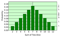
A histogram is a kind of bar graph, but rather more specific. Essentially, it is also a graphical display of values or frequencies. Unlike the ordinary bar graph, a histogram is used to show values of recorded data elements that are grouped or categorized.
In regards to the histogram, the data elements that are recorded and categorized, are usually numbers. Basically, these grouped elements are arranged in the visual data presentation to form an uninterrupted range of values from left to right. Having said that, the x-axis of the chart for the histogram is seen as a one long range of values. Thus, you can visually perceive the flow of frequency changes, and easily determine when patterns are evident.
The appearance of the histogram as a bar graph, is often depicted with the bars touching each other. This is to indicate that the items are non-discrete, unlike the items shown in a bar graph.
Summary:
1. A bar graph is a kind of visual representation of comparing values.
2. A histogram is a kind of bar graph that displays a more specific way of presenting comparisons.
3. The bar graph is often used to show a visual comparison of discrete elements, while the histogram is used to show the frequency of non-discrete, continuous items.
4. The items in the histogram are usually numbers, that are grouped or categorized in such a way that they are considered to be ranges. In regards to bar graphs, the elements or items are taken as separate entities.
5. Normally, a bar graph is drawn or depicted in a such a way, that a bar representing the frequency of an item, is not touching the bar of the next item. There is a visible space between the bars.
6. The bars in the histogram are always the touching the next one. There are no spaces in between.
- Difference Between Lymphoma and Leukemia - March 7, 2024
- Difference Between CP and CPK - June 8, 2010
- Difference Between PPTP and L2TP - June 7, 2010

thanks a lot for this one, it helps to distinguish the comparison in a more clearer view